

Affordable Doesn't Mean Forgettable
We hear this from owners in every cycle: "If we pull price down, design has to come down with it." That belief kills deals. It also misses the one lever that works in every market: desirability. People do not pay more because a building was expensive to build. They respond because it feels good to live there.
That is true at the top of the market. It is true in workforce housing. It is true in affordable. The projects that lease first are not always the biggest or the flashiest. They are the ones with efficient layouts, honest light, and simple shared spaces that neighbors actually use.
We have delivered buildings across San Diego infill where the budget was tight and the schedule was stubborn. North Park. Normal Heights. City Heights. Those choices do not belong to any one price point. They belong to a way of thinking. We design for residents first. Constructability and long-term performance are addressed through that lens.
Affordable, Desirable, and Durable
Affordability sets a boundary. It does not write the whole story. We start each project with three touchstones. The home has to feel generous. The design has to help daily life. The building has to hold up in use.
Generous does not mean large. It means proportion and sequence. A living room that holds a sofa and a small table. A kitchen with enough clear counter to set down a bag of groceries and still make dinner. An entry that gives you two steps of pause before you reach the living space.
Daily life is the test that matters. Where do shoes go. Where does a bike hang. Where do you charge a phone when a friend is over. If your plan answers those questions with ease, the home feels calm. Calm sells. Calm also keeps people longer.
Durability is not about thickening everything. It is about choosing the right weak spots to reinforce. Corners at corridors. Cabinet doors that take a thousand pulls. Floors that hide scuffs. When residents see that a building stays cared for, they understand that they are respected. Respect turns into tenancy length. Tenancy length turns into stable revenue.
Efficient Layouts That Feel Generous
Room count is a blunt instrument. Geometry is the scalpel. We don’t design only for fixed building elements—we design for how people actually live. Our layouts account for furniture placement, TV and media walls, circulation clearances, and everyday movement through the home. This ensures spaces function intuitively, feel calm rather than cramped, and support daily life without residents having to work around the architecture.
| Room Shape | Dimensions | Feel | Function |
|---|---|---|---|
| Near square | 12 x 12 | Balanced, calm | Accepts sofa + small table |
| Long and thin | 10 x 14 | Squeezed, awkward | Forces trade-offs |
One bed plans can carry a lot of weight when the living room is balanced. You can feel the squeeze even if you cannot name it. Residents always know the difference, even if they do not use the words.
Winning Studios Back
Studios are where many projects lose livability. We win them back with two moves:
- A bed niche with a real wall and a real door. When a queen bed doesn’t face the entry, the studio reads as a home rather than a room.
- A work zone with power and a view line. When a laptop can sit near a window with an outlet where it belongs, the space can comfortably support occasional work-from-home needs without overtaking the kitchen.
Storage Matters More as Unit Size Comes Down
We fight hard for a coat closet near the door, a pantry bay that’s more than a skinny shelf, and bedroom closets that don’t end in dead corners. Tall closets win. Even twelve extra inches of height creates room for luggage and seasonal bins.
Less clutter reads as more space.
Bathrooms Carry Outsized Impact
Full bathrooms include a tub-shower combination—this is non-negotiable for families with children, and without a tub it does not count as a full bathroom. We design every bathroom to maximize usable floor area while prioritizing function, accessibility, and code compliance.
Natural Light That Lifts Wellness and Desirability
Light is not a finish. It is a health input and a mood setter.
We pursue daylight with three tactics that don’t break budgets:
| Tactic | Implementation | Benefit |
|---|---|---|
| Stretch windows vertically | Up to the 9-foot line when structure allows | More daylight, taller feel |
| Daylight Zoning | Primary living spaces along edges of the building while secondary spaces are deeper into the plan | Supports wellness & reduces reliance on artificial light |
| Light courts & wells | Bring daylight into corridors and deeper plans | Reduced reliance on artificial light making entry ways and corridors feel vibrant |
Intentional Building Orientation & Unit Planning
We study site orientation, setbacks, and massing early to maximize daylight access where it matters most—living spaces and primary bedrooms—while minimizing glare and overheating. Thoughtful unit planning ensures natural light supports daily rhythms, comfort, and long-term livability.
Window Placement & Proportion, Not Just Quantity
Rather than relying on window counts alone, we carefully locate and size openings to balance daylight, privacy, and wall functionality. Well-proportioned glazing improves interior brightness while preserving usable wall space for furniture and storage. Strategic window placement and landscaping work together to benefit from natural lighting while maintaining privacy.
Light Wells & Vertical Daylighting in Interior Areas
In deeper floor plates or interior corridors, we introduce light wells and vertical openings to bring daylight into spaces that are typically dark. This improves spatial comfort, enhances wayfinding, and reduces dependence on artificial lighting throughout the building.
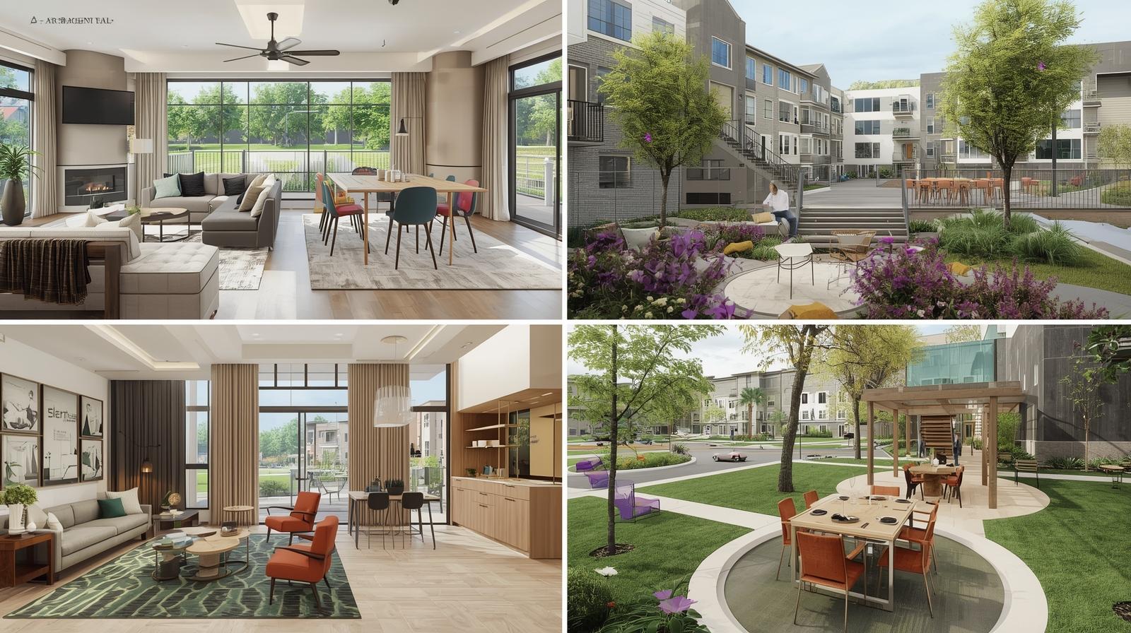
Shared Amenities That Support Daily Life
Amenities aren’t about spectacle. They’re about repetition. If a resident uses a space three times a week, it becomes part of daily life. If they never use it, the space becomes underutilized and disconnected from the building.
A pocket lounge near the lobby for a quick call.
A simple table at a window for two neighbors and coffee.
A tot-lot that fosters family friendships within communities.
These are placement decisions, not capital-heavy ones.
Visibility Drives Use
Outdoor rooms work best when they sit where people already pass:
- A sunny bench between the elevator and individual units
- A shaded seat near the gate where people wait for rides
- A small grill zone with seating for outdoor gatherings
If people see a space, they try it. If it works once, they return.
Keep package lockers on the natural path from sidewalk to elevator. No one wants to carry a box through a maze. If a small cold-storage parcel cabinet fits, it adds weekly value.
Privacy, Landscaping & Community Gathering
Strategic window placement and landscaping work together to give individual units both natural light and privacy. Ground-floor units benefit most from thoughtful setbacks and planted buffers that screen without blocking daylight.
A centrally placed tot-lot fosters family friendships within communities. When children play where parents can watch from nearby seating, spontaneous connections form—and resident satisfaction rises.
Individual units with seating for outdoor gatherings—even a small balcony table or a shared courtyard bench—extend daily living beyond the unit walls.
Spec Choices That Support Long-Term Care
Affordability fails when maintenance eats the budget. We protect the operating plan with finishes that look warm, wear well, and clean easily.
| Element | Recommendation | Why It Matters |
|---|---|---|
| Floors | LVT or individual planks with visual variation | Individual planks can be replaced without demolishing an entire unit. Hides wear, simplifies cleaning. |
| High-Pressure Laminate Cabinets | Resistant to scratches, dents, and moisture | Easy to clean, hard to abuse |
| Fiberglass Entry Doors | Durable, dent and ding resistant | An excellent choice for when tenants move in and out—prevents damage that hollow-core doors absorb immediately |
| Traffic Coating on Concrete | Protection from water intrusion and wear | Bridges hairline cracks, slip resistant, extends the lifespan of exposed concrete |
| Standardized Unit & Finish Design | Repeatable details and consistent material selections | Simplifies leasing, maintenance training, unit turns, and long-term replacements—making day-to-day property management more predictable and cost-effective |
This is the difference between a building that looks worn within a year versus a building that is crisp and clean with little maintenance for years to follow.
Operations Inside the Plan
A building that is easy to run will feel better to live in. We design operations into the plan. That starts with the ground floor.
The Entry Sequence
- A direct sight line to the desk or the management door
Residents read trust in the first fifteen feet. Win that moment and the whole building benefits.
Service paths matter. Trash should never cross the lobby. Deliveries should follow obvious routes. Simple additions like hose bibs and floor drains save staff time and protect shared spaces.
The back office deserves a place where focused work can happen without constant interruption. Good layouts support good stewardship.
Standard layouts simplify staff training, maintenance, and unit turns.
Cost Discipline Without Killing Delight
Tight budgets reward early decisions. We guard four items because they carry outsized value:
A Simple ROI Frame For Affordable Design
When teams debate features, we use a quick, practical check:
Work With Us
If you want a feasibility pass that balances livability, durability, and buildable yield, share the APN, available utility information, and your high-level project goals. We evaluate site conditions, frontage, applicable housing incentives, and design constraints to identify strategies that add value without unnecessary complexity. You’ll leave with a clear, code-aligned path toward a clean submittal and a resident-focused design framework that can be delivered without surprises.